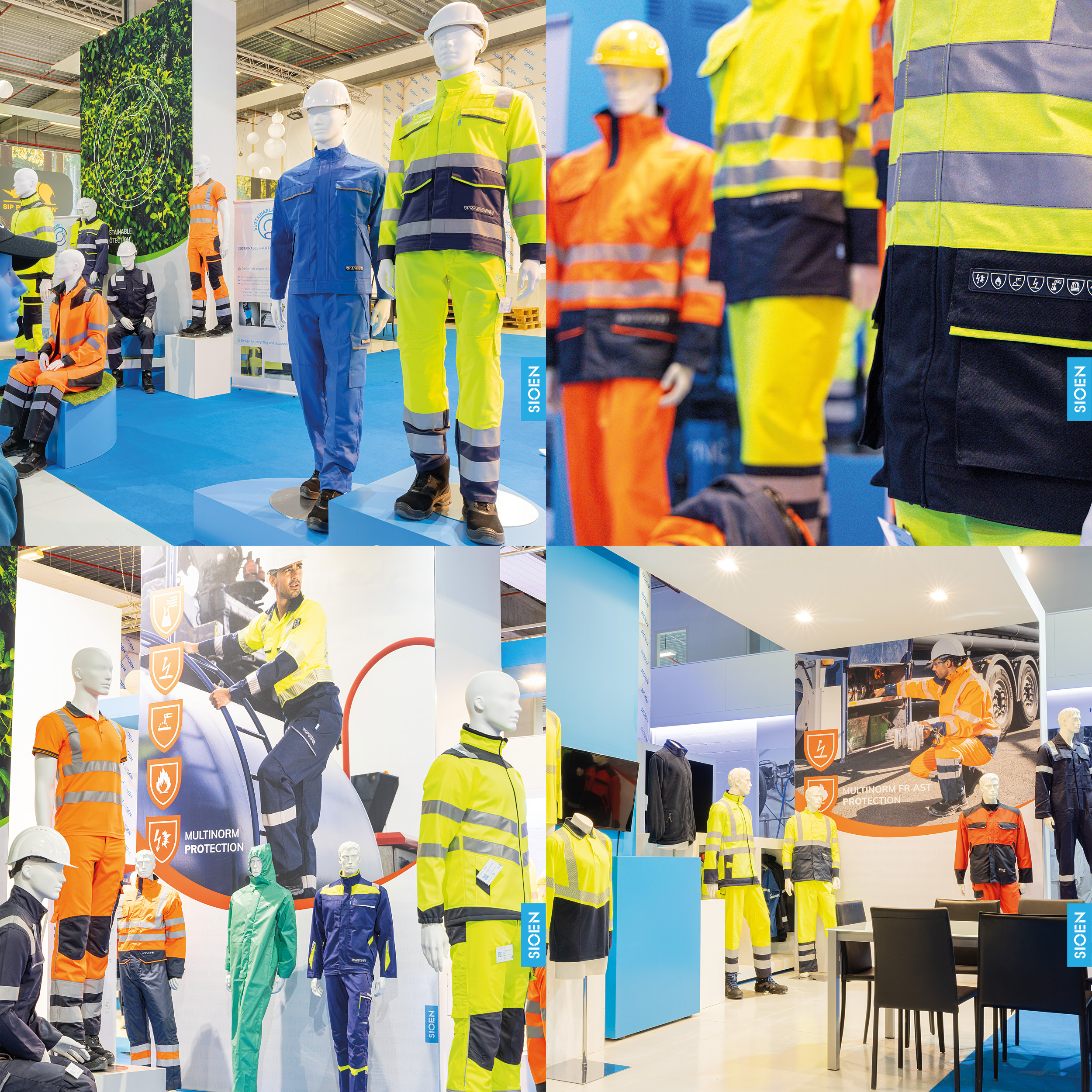
In the past few months, we gave our showroom corner at Sioen HQ a complete make-over. Our goal? To improve client’s visit experience and to provide better insights into the build-up of our brand, its ranges and protection levels. Read on to discover more about the changes we’ve made.
1. New layout for a more logical walk-through;
Taking a walk through our showroom corner has never been this logical. The new layout creates a seamless flow, guiding you from one product range to another.
2. Better display of our product offer;
Less is more! We have reduced visual clutter by making the conscious decision to show less, yet more pertinent mannequins per range and subrange.
3. Improved presentation of the different ranges and clothing layers;
Correct protection often means layering up. ARC flash protection, cold protection,... The updated showroom gives you clearer insights into the different protection layers included in our offer.
4. Updated mannequins, samples and visuals;
Out with the old, in with the new! All old clothes and clothing samples were removed, making place for the most recent versions. Moreover, the old banners on the walls were updated with shiny new ones.
Have we piqued your interest? The pictures below give you a first idea of the result. Would you rather admire the updated showroom in person? Do not hesitate to reach out to your sales manager.
